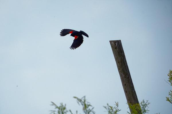
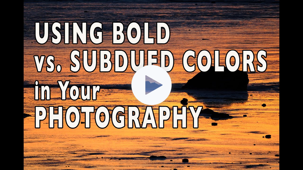
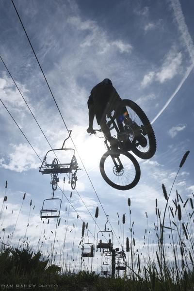
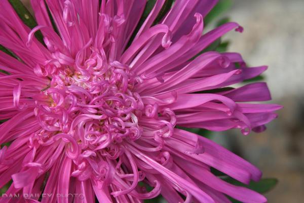
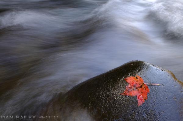
These two photos above have unique looks, even though they are of similar subjects. One has a more calm feel, where the other has a bit of boldness that catches the eye in a different way.
Sure, one has more action, but just as important is the color scheme that each photo uses. Color is such an
important aspect of photography, the way we use colors in our photo dictates in a large part the overall feel of our photo.
In this video below, I show you how to use bold, highly saturated color vs. more subtle, subdued colors in your images to vary your visual effect, and better communicate the specific message or emotion you’re trying to convey to
your viewers.